Quick Graph of US Electricity Generation Showing the Breakdown Of the Wind, Solar, Biomass, Geothermal Portion
I got motivated to build a small spreadsheet using tables 1.1 and 3 from the Energy Information Agency’s 2008 US Electric Power Monthly publication. Here is the comment that I have seen in a number of places that I want to clarify (most recently in an article titled THE NUCLEAR ENERGY DEBATE — A CASE STUDY IN REACTIONARY AMERICAN LIBERALISM):
Meanwhile, renewable sources — wind, solar, geothermal, and biomass — account for three percent of total net electical generation. Thus, even if renewable sources quadurple over the next ten years, the combined production from emission-free sources (nuclear plus renewable) will be only slightly higher than it is today.
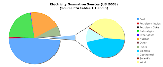
What irks me a bit about this comment is the way that the 3% is distributed; about 40% of it is from biomass; about 80% of that is from wood products. That part of the “renewable” quartet has been essentially constant since the late 1980s. Geothermal, another 11% of the quartet, has also remained essentially constant for the past 20 years while solar is so small even today that it just barely shows up even in the exploded view (0.8 billion kilowatt-hours out of a total generation of more than 4100 billion.)
Here is the graph and the raw numbers that you can play with at your leisure.

Units in table below are billion kilowatt hours.
| Coal | 1994 |
| Petroleum liquids | 31.2 |
| Petroleum Coke | 14.2 |
| Natural gas | 876.9 |
| Other gases | 11.6 |
| Nuclear | 806 |
| Other | 10.4 |
| Hydro | 248.1 |
| Biomass | 55.9 |
| Geothermal | 14.9 |
| Solar/PV | 0.8 |
| Wind | 52 |
Note: the total adds up to 4116, but the total amount in the US generated and delivered to the grid is 4110. The difference is that 6.2 billion kilowatt hours were used to pump water uphill for storage and future use. The EIA counts that as a negative in the table to prevent double counting.
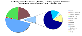
Update: Based on some of the comments received, I have created a couple of additional versions of the generation source chart. The first one shows what happens if you included large scale, traditional hydroelectricity as a renewable resource – which is it. In the US, it is not a resource that has much room for expansion, and it is often under pressure for reduction since the dams can have a large impact on fish, land use, and river flows for downstream users.

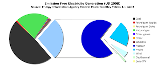
The second chart shows why you have frequently heard about how nuclear provides nearly 70% of the emission free electricity in the US. In this case, I have removed biomass from the grouping since it definitely results in air polluting dumping, just like any other combustion process. I am not one who can easily follow the logic that whatever carbon gets released in the process would have been released anyway; if that was true, how did all of that carbon based plant matter get stored over millions of years for our use today in the form of coal extracted from underground mines or peat dug up in places like Scotland?

Note: I tried hard to point to the “Solar/Pv” segment on the chart so that I could change its color, but my mouse pointing skills were simply not fine enough to pick the tiny slice out of the rest of the chart. I guess it is appropriately colored yellow by default; it sort of fades out of visibility in terms of generation, though solar is certainly not something that you never hear about.
