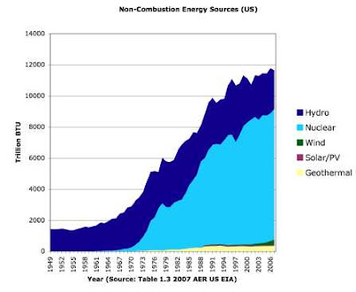
Second try at graph for non combustion energy in US
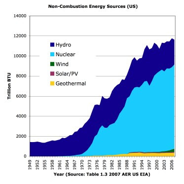
I have done some reformatting of the graph of non combustion energy sources in the US during the period of 1949-2006. Following the suggestion of Kirk Sorensen, I put wind, solarPV and geothermal on the bottom of the chart in an attempt to better illustrate their growth.
Feedback is welcome. Source of the data is Table 1.3 of the Energy Information Agency’s Annual Energy Review, posted at http://www.eia.doe.gov/emeu/aer/overview.html on June 23, 2008.

Update: (Posted at 4:40 am on Friday July 4, 2008) This graph generated a useful discussion about the units and the method of comparison between various energy sources. I learned that the Energy Information Agency table used to create the chart makes the assumption that electricity generation has an efficiency of about 33% (10,400 BTU per kilowatt hour).
When the statisticians build a table that compares some energy sources that produce heat and are also used to produce electricity (fossil fuels, geothermal) against other energy sources like the wind, hydro, nuclear (so far) and solar photovoltaics that produce only electricity they attempt to equalize the comparisons.
Electricity production from various energy sources (nuclear, geothermal, wind, solar PV or solar thermal electricity) are converted into thermal energy using 10,400 BTU per kilowatt hour while energy sources using direct thermal energy (solar water heaters, geothermal heat pumps, fossil fuel space heat, fossil fuel process heat) are simply measured in BTU. (Without the 33% efficiency assumption for electricity, the real conversion is 3412 BTU per kilowatt hour.)
Here is a slightly modified version of the graph with a better legend and cleaner text.

Update: Posted July 6, 2008 0425
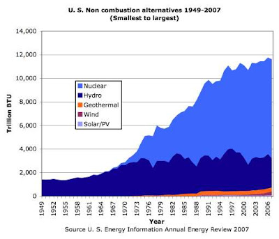
A reader requested a version of the above with the energy sources ordered from smallest to largest (bottom to top). Here is the result for anyone to use under creative commons (full attribution). (Snarky note: there really is a tiny bit of purple down in the bottom right corner of the graph that represents the amount of solar thermal and solar PV energy calculated by the EIA and adjusted by multiplying the electricity by a factor of 3.)

