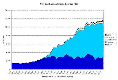
Non combustion energy source growth
This is a time compressed post whose major purpose is personal – I need to work a bit on my graphing skills and on my use of the Blogger software that enables Atomic Insights.
Quite a while ago, I promised to find some graphs that would show the real energy path that the US has taken to show the contrast with them compared to the “Soft Energy Path” proposed by Amory Lovins in 1975. I have been engaged in a couple of activities recently that reminded me of that promise, so I started working.
Below, you will find a graph showing non-combustion energy sources for the US from 1949-2007. The source data come from the US Energy Information Agency Table 1.3 from the Annual Energy Review, 2007. I am sure you will notice where essentially all of the growth has taken place.

