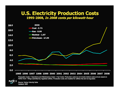
US Electricity Production Cost Graph From 1995 – 2008

One thing that continues to befuddle me is the consistently repeated myth that nuclear energy is expensive energy. I want you to take a hard look at the above graph. It is a slightly modified version of the original which can be found buried several layers down at the NEI web site under the heading of Resources and Stats. The major change that I made was to alter the background to make the lines show up a little better on the web.
As you can see, the spread between nuclear energy production costs and coal energy production costs is getting wider with each passing year. As of the end of 2008, the difference between “cheap” coal and “expensive” nuclear was more than 30% with nuclear in the lead. If you cannot read the graph clearly inside the blog post, just click on it to bring up a larger version.
Makes one wonder a bit, doesn’t it?
PS – Sorry for my lack of a July 4th post. I was kind of laid up and not able to focus clearly.
